Reactions
A two-day craft intervention on LinkedIn's highest-frequency interaction

Overview
Reactions are one of LinkedIn's highest-frequency interactions — millions of times a day, across every post in the feed. When the menu was being migrated to a new tech stack, I saw a low-effort, high-impact opportunity: tighten the craft before it shipped. This was a two-day side effort, not a dedicated workstream.
Change
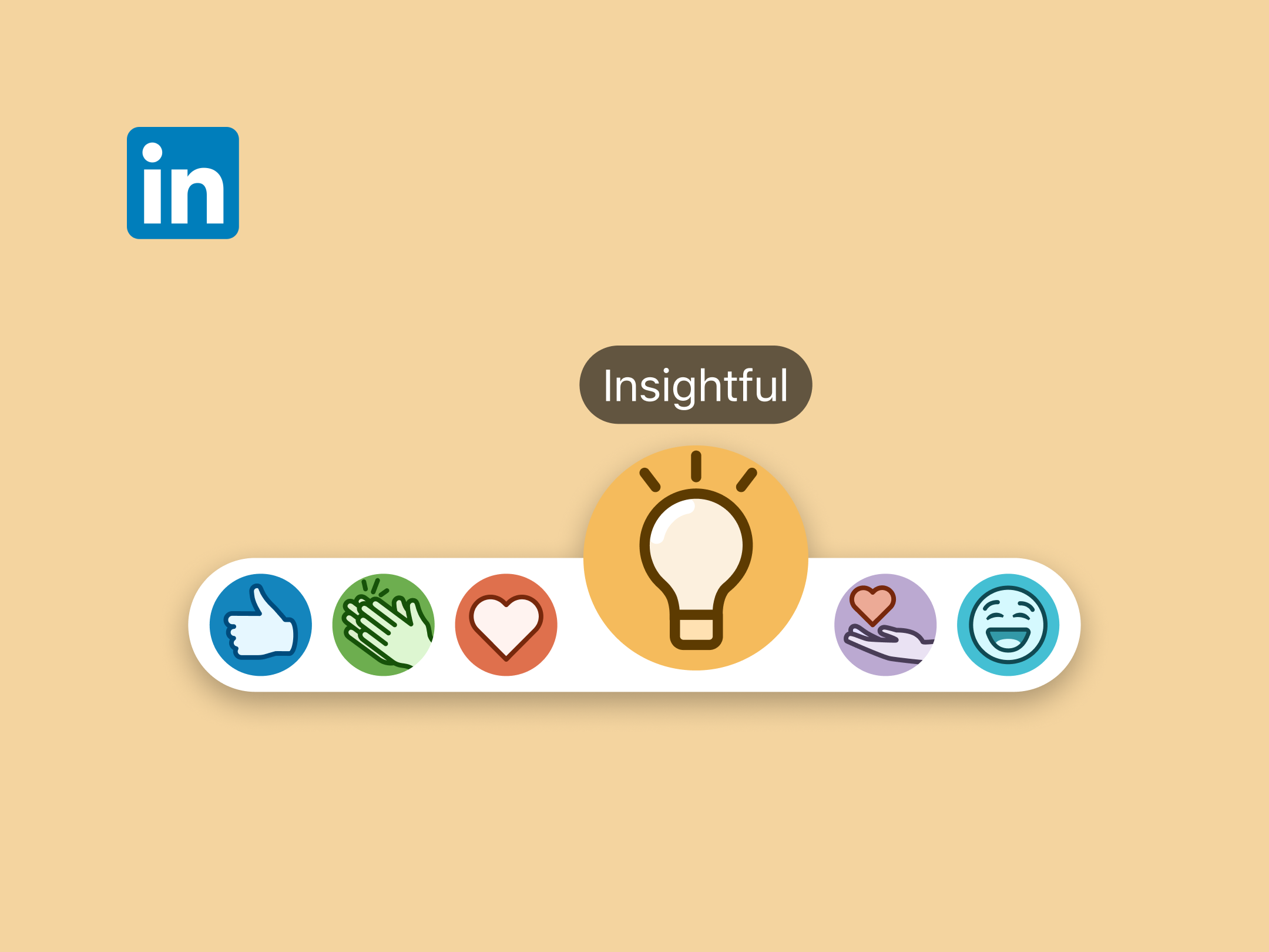
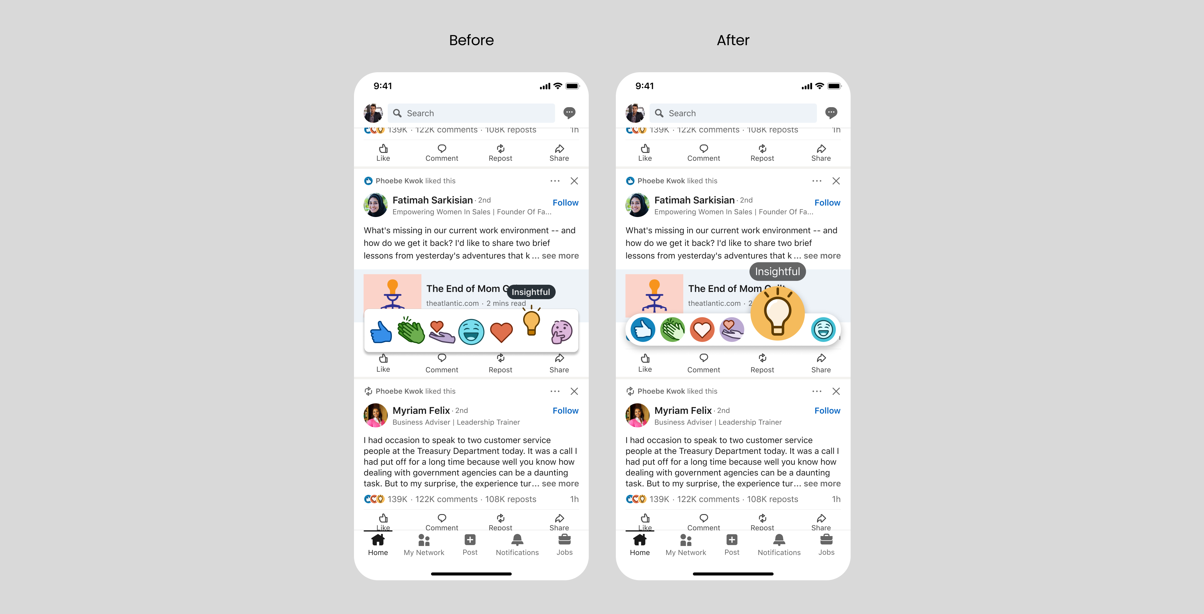
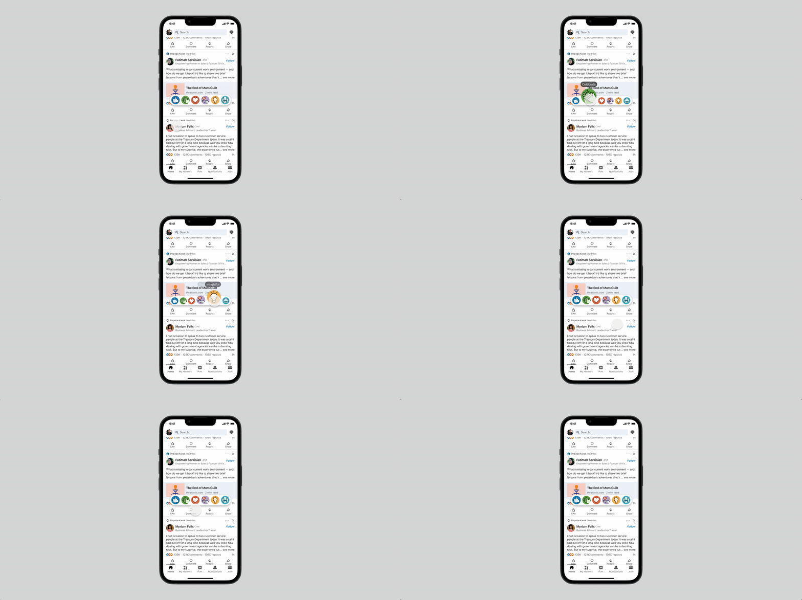
Working within the existing asset library, I refined the icon shapes for better visual balance and consistency, and improved the selection motion to feel more tactile and intentional.

Impact
Small investment, outsized reach. The improvements shipped with the migration and drove a modest but meaningful lift in reactions usage — a reminder that craft compounds at scale.
